Jasper Johns: 10 works to know
Jasper Johns: 10 works to know
By Alice Primrose
Published 1 November 2017
Over the past six decades, Jasper Johns’s paintings, sculptures, drawings and prints have left an indelible mark on art. With the RA showing a major survey of his practice to date, here’s a closer look at ten of his key works.
-
-

1. Flag, 1958
Jasper Johns first painted the American flag in 1954–1955 aged 24, and it’s been a frequently recurring motif in his practice ever since. For Johns, “using the flag took care of a great deal for me because I didn’t have to design it. That gave me room to work on other levels". He approached the flag as an object, rather than a symbol – this painting “is no more about a flag than it is about a brushstroke or about a colour or about the physicality of the paint”, as he said in 1965. He was still in his twenties when he painted this particular flag in 1958, but already had a solo show at the taste-making Leo Castelli Gallery and his work added to the collection of The Museum of Modern Art.
Throughout his career Johns has used the ancient method of encaustic: heating beeswax, tree sap and pigment and layering it onto the canvas, “as evenly as one would frost a cake”, according to Johns expert Barbara Rose. The paint sets very fast, allowing him to work quickly and preserve the textured surfaces. Puzzling over Johns’s early work, the experimental composer (and friend of the artist) John Cage suggested that “looking closely helps, though the paint is applied so sensually there is the danger of falling in love”.
-

-
-
2. Target, 1961
Along with flags, targets are another of Johns’s striking motifs from his early career. Associated with repetition – reciting the national anthem, practicing firing skills – these commonplace items were ingrained in mid-century American life. Johns used them as part of his wider exploration of “things that are seen and looked at, not examined”. He was one of the first artists to depict everyday objects and symbols in the mid-1950s, pursuing “things which suggest the world rather than suggest the personality”, as he said in 1965. In 2007 the New York Times critic Holland Cotter wrote of Johns’s early works: “simply by existing they closed the door on one kind of art, Abstract Expressionism, and opened a door on many, many others”. Elevating mundane objects to the status of high art was a blow to the mystique of canvases splattered with the abstract emotions of their creators.
-

-
-
3. Painted Bronze, 1960
With Johns’s early shows at Leo Castelli’s gallery proving very commercially successful, it’s claimed fellow artist Willem de Kooning quipped of the gallerist: “you could give that son of a bitch two beer cans and he could sell them”. When word got back to Johns, he thought “what a wonderful idea for a sculpture” – and so Painted Bronze was promptly made and sold. The sculpture has been read as a wry dig at the machismo of de Kooning and his fellow Abstract Expressionists; a step away from “living an aggressively heterosexual life and getting drunk both in and out of the Cedar Street Tavern”, as art historian Fred Orton has written. With its delicately painted Ballantyne branding, the sculpture ignited ideas about the everyday ephemera of mass consumerism in the New York art scene – Andy Warhol made his Campbell’s soup cans just two years later. Abstract Expressionism was no longer the dominant art of the day; pop art was on the horizon.
-

-
-
4. Painting with Two Balls, 1960
“At once, Johns extinguished speculation about the meaning of individual paintings and directed attention to them as objects among other objects”, wrote the critic Harold Rosenberg. Painting with Two Balls proclaims its own “objectness” by revealing the apparatus of its canvas panels – prized apart by wooden spheres. By creating a gap in the painted surface, Johns refutes any romantic ideas that you could leap through the canvas and into the world of the painting. The viewer is merely confronted with the dark wall; a dead end. Yet there are as many meanings to be found in a Johns painting as there are layers of encaustic: Painting with Two Balls could also be interpreted as grappling with the macho enterprise of Abstract Expressionism. Discussing the movement years later, Johns recalled: “It’s a phrase I used to hear all the time… ‘It was a ballsy painting’… ‘He was really painting with two balls’”.
-
-
-
5. Painting Bitten by a Man, 1961
This small painting – just 17cm across – was described by the New York Times as a “frozen scream”. Its ambiguous title doesn’t specify that it is Johns’s teeth marks in the encaustic, but the work is part of the artist’s ongoing exploration of a body’s contact with the canvas. Art historian Christina Poggi writes that “the encaustic surface simulates human skin – now congealed and reified”. Around the same time, Johns was covering his naked body in baby oil, gently lying face down on paper, and then sprinking charcoal dust onto the ghostly imprint. This bitten painting, though, has a “stark force”, even “rage”, says Poggi – it has “enacted a form of wounding” that “has overstepped the boundaries of decorum”. Certainly, gnawing your painting and presenting it in a gallery was enough for some critics in the early 1960s to question the work’s status as art.
-

-
-
6. Walkaround Time, 1968
Over dinner at Marcel Duchamp’s New York home, Johns suggested to his friend – the choreographer Merce Cunningham – that they make a dance piece incorporating an artwork by their host, The Large Glass. Duchamp voiced an immediate concern: “who’s going to do all the work?”, but was pleased with the idea once it was established that it wouldn’t be him. The Large Glass is a transparent, window-like sculpture almost three metres tall, incorporating shapes made from lead foil, fuse wire and dust. Johns stencilled the imagery from the work onto clear vinyl sheets stretched over metal frames to make a stage set for Cunningham’s choreography.
Although you won’t find this work in our show, it’s an important milestone as the beginning of his 13 years as Artistic Advisor to Merce Cunningham Dance Company – a relationship you can see reflected in the imprint of Cunningham’s foot in Johns’s 2007 Numbers work, on display in the exhibition. In this role he brought many other artists together to create collaborative works: Andy Warhol filled the stage with helium balloons for Rainforest (1986), Frank Stella built a rainbow-coloured pyramid with matching dancers’ leotards in Scramble (1967), and Bruce Nauman placed ten huge electric fans between stage and audience for Tread (1970).
-
-
-
7. Bridge, 1997
A “catenary” is the shape formed by a chain hanging from two points – as demonstrated by the string attached to the canvas in this painting. In the 1990s Johns began a series named after and exploring the shape, which included this Bridge painting, among 60 other works. Likening the curve to the soaring cables on suspension bridges, he chose the work’s title because it suggests “connections of thought” and “connections among all the various ideas we have of space” (spot the silkscreened print of a galaxy and the Big Dipper constellation at the top of the canvas). While making the work he referred to a photograph published in the New York Times the previous year, showing a catenary formed by the tube of an IV fluid bag held up by a Rwandan mother for her seated daughter. The artist was also thinking about Frida Kahlo’s double self-portrait, Las Dos Fridas, which shows two Fridas sitting next to each other, their exposed hearts connected by a blood vessel. Both convey, in Johns’s words, “things connected by tubing which is sending energy” – a vitalising bridge between two people, or even aspects of one person.
-

-
-
8. Usuyuki, 1981
This crosshatch pattern (historically used by artists to create shadowing) has been part of Johns’s work since the 1970s, when he saw the pattern on a passing car driving on the Long Island Expressway. The artist worked with this motif almost exclusively from 1972 to 1983, because “it had all the qualities that interest me – literalness, repetitiveness, an obsessive quality, order with dumbness, and the possibility of complete lack of meaning”. Despite the avowed “lack of meaning”, the journalist Deborah Solomon recalled how critics “had a field day interpreting the ‘hatches’”; some claimed they conveyed a secret code known only to Johns and his close companions. This screenprint’s title translates from Japanese as “light snow” – the artist spent many extended stays working and exhibiting in Tokyo during the 1960s and ‘70s. In this work, Johns shows a technical flair learnt over decades of printmaking, using 12 screens to produce delicate gradations of colour and layers. This particular Usuyuki isn’t in our show, but look out for a painted version of the same name.
-

-
-
9. Fall (from the 'Seasons'), 1986
Though Johns claimed in 1988 that “I don’t want my work to be an exposure of my feelings”, and in 2007 said the trait he most dislikes in others is “the tendency toward self-description”, in his late career his work has offered glimpses into his biography. In this painting, “things dear to him are listed, pored over, set down on the canvas in an idiom that is both rich and dense”, wrote the art critic John Russell. The strings, spoons, outstretched arms and Rubin vases in this painting can also be found in other works throughout our exhibition. Fall is one in a series of four paintings known as the ‘Seasons’ which together explore growth, ageing and the cycle of life. As Russell continued: “If the ‘Seasons’ does have a central meaning, it may well be that catastrophes can be borne, however awkwardly and painfully, and that a shattered self can be put together again.”
-
-
-
10. Regrets, 2013
Johns has a stamp in his handwriting which he uses to respond swiftly to the numerous invitations that arrive in the mail – it reads “Regrets, Jasper Johns”, and is apparently the inspiration for the title of this painting. Part of a series of the same name, this work is based on a tattered, stained photograph of the artist Lucian Freud commissioned by fellow artist Francis Bacon – though it’s hard to discern the original image if you’re only looking at the painting. Begun when Johns stumbled across the photo in 2012, the series continues his lifelong dictum, as he described it in 1964: “Take an object. Do something to it. Do something else to it”. And much like the rest of Johns’s work, there are fragments of meaning but little explanation from the artist. Yet Johns was also an avid believer in a dictum of Duchamp’s: “the creative act is not performed by the artist alone; the spectator brings the work in contact with the external world by deciphering and interpreting its inner qualifications and thus adds his contribution to the creative act”. Maybe we know more than we think.
-

Read more
-
RA Exhibitions
> 1 year ago
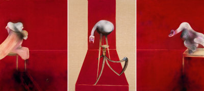
The truth in Francis Bacon’s work
Ahead of the exhibition ‘Francis Bacon: Man and Beast’ Jenny Saville RA reflects on the profound impact Bacon has had on her life and work.
-
Artists
> 1 year ago
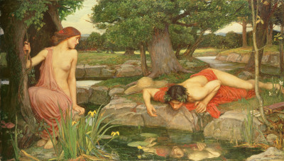
Nature and myth in art
Author, classicist and comedian, Natalie Haynes, explores the theme of nature in classical mythology, from Bernini and Giambattista Tiepolo, to John William Waterhouse RA.
-
RA Exhibitions
> 1 year ago
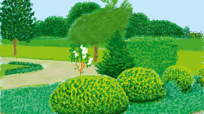
How to paint ‘en plein air’ like Hockney and Constable
David Hockney works outdoors to capture his vibrant spring scenes – in a tradition that goes right back to Constable and the masters of the 18th century. Artist and tutor Andy Pankhurst shares some tips to get you started…
-
Our Collection
2 years ago
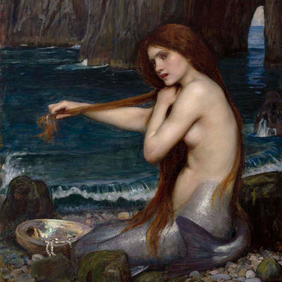
In 60 seconds: Waterhouse’s ‘A Mermaid’
Spend 60 seconds exploring the dark mythology behind John William Waterhouse RA’s ‘A Mermaid’.