Protest power: 11 artworks that spilled into the street
Protest power: 11 artworks that spilled into the street
By Alice Primrose
Published 24 March 2017
As protest marches find renewed relevance and the Imperial War Museum looks back at 100 years of peace protests in its latest show, here are 11 images by artists that have come to the aid of political movements from the 1950s to today.
-
-
War is not healthy…, Lorraine Schneider, 1968
“It had to say something, something logical, something irrefutable and so true that no one in the world could say that it was not so”. Amid increasing tensions surrounding the Vietnam War, the artist Lorraine Schneider submitted her “own personal picket sign” as part of a miniature print show at New York’s Pratt Institute in the late 1960s. But as she recalled, “I never dreamt that my modest little etching would turn into a huge banner”. The design was spread widely by the activist organisation Another Mother for Peace, keen to distance themselves from the “bearded, sandaled youths” and “wild-eyed radicals” also protesting the war, but nonetheless determined to take their own action against the government’s increasing demand for troops. They printed Mother’s Day cards – bearing the artist’s design along with a poem demanding peace – and coordinated over 200,000 to be sent to members of Congress in Washington. Envisaging the advent of a brighter world without military conflict, in 1972 Schneider said, “it is up to us, the artists, the people who work in media, to prepare the emotional soil for the last step out of the cave".

-

-
-
A.I.D.S, General Idea, 1988
General Idea aimed for a “parasitic process” to spread their artworks. The three-man Canadian art collective seized on popular and familiar imagery in the 1980s and 90s to spread awareness of the AIDS crisis in their country and the USA. They said the image should “use available distribution and communication systems" so that “it hooks into them and is carried through these systems” to “proliferate itself”, just like the spread of the HIV virus. Their design was a pre-internet viral image. A.I.D.S. was based on a popular greetings card by artist Robert Indiana in 1964, though the original read LOVE. A "parasitic process” may sound sinister, but the collective’s aim was really to create a “normalising effect” around AIDS, “to make it something that can be dealt with as a disease rather than a set of moral or ethical issues”.
-

-
-
Peace logo, Gerald Holtom, 1958
Gerald Holtom sketched what is now widely known as “the peace logo” for the first London to Aldermaston march in 1958: an 8000-strong anti-nuclear protest walk, covering 52 miles from Trafalgar Square to Berkshire’s Atomic Weapons Research Establishment. Taking visual inspiration from the semaphore letters for n and d (nuclear disarmament), the artist presented his design to local anti-nuclear groups but it wasn’t immediately glued to a placard. One rejection letter described the work as “quite obscure” with “no meaning at all”, and said they would fear being mistaken for “some secret society (Ku Klux Klan!)”. The design was later accepted by larger anti-nuclear organisations, and once it became integrated with the Campaign for Nuclear Disarmament, the simple circle could hold its own among a white dove or olive branch at any protest. Holtom has kept his design staunchly copyright free, welcoming its dissemination and reinterpretation – see most recently the artist Jean Julien’s Peace for Paris version, below.
-

-
Gerald Holtom's sketches for his anti-nuclear protest symbol
Badges courtesy of Ernest Rodker
Jean Julien, Peace for Paris, 2015.


-
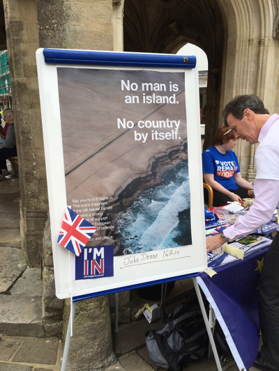
Anti-Brexit Campaign, Wolfgang Tillmans, 2016-present
“It’s now the duty of us all to defend the pillars of the free world order that was created over the last seventy years. To hold the centre ground, and not to contribute to the centrifugal energies around us”, wrote the artist and proud European just days after Britain voted to exit the EU. Tillmans’ series of posters and t-shirts proliferated around Britain last year, bolstering the official Remain campaign that he saw as “lame and lacking in passion”. This year, as the Netherlands prepared to vote in their next governing party, the two founders of Amsterdam-based international fashion magazine Fantastic Man adapted and expanded Tillmans’ designs to urge their own country to "protect the EU”. The posters were free to pick up from various major institutions around the Netherlands, and have so far been translated into 11 other European languages. As the duo say, “the campaign is a call to work together, to adapt the posters, to spread them and to talk with people of opposite beliefs”.
-
'Protect the EU' campaign by Jop van Bennekom and Gert Jonkers, after Wolfgang Tillmans
'Protect the EU' campaign by Jop van Bennekom and Gert Jonkers, after Wolfgang Tillmans
Wolfgang Tillmans' poster used in the Remain campaign, Chichester, June 2016


-
-
Black Panthers, Emory Douglas, 1960s-80s
“The community then wasn’t a reading community, but they learnt through observation and participation. People would get the gist of the story just by looking at the pictures, and maybe reading the captions”. The artist Emory Douglas joined the recently formed African American socialist revolutionary Black Panther Party in 1967, soon became their minister for culture, and stayed until the party’s dissolution in the early 80s. His designs were made with cheap solutions in the studio apartment of fellow panther Eldridge Cleaver: often only one colour was used, and woodcut was mimicked with marker pens. The posters were pasted throughout African American communities, and the illustrations filled the party’s notorious newspaper, The Black Panther. His artwork landed his name on the FBI’s watchlist, not least, perhaps, because he coined the term “pig” for police through his porcine depictions of corrupt officers. The artist, still working at age 73, continues to sign his infamous posters and books with “the struggle continues”.
-

-
Protect and Survive, Peter Kennard, 1981
Commissioned by the Greater London Council (led by the staunchly left-wing Ken Livingstone), Protect and Survive is one in a set of 18 images responding to pamphlets distributed by the Thatcher government to offer guidance in the event of a nuclear attack. The GLC refused to support the government’s civil defence exercises, as did almost 200 other UK local authorities in the early 1980s. In Kennard’s words, the pamphlets were “full of totally ludicrous instructions, like telling people to remove their lace curtains in the event of an attack”. The artist thought of his series of images as “a visual toolbox for activists working within the movement… Removing them from the confines of high art and into popular culture is what the work is about.” Kennard is also one half of the duo responsible for the notorious Photo-Op image of Tony Blair that circulated during the UK’s invasion of Iraq.
-
Peter Kennard, Protect and Survive, 1981.
Photomontage on paper. © Peter Kennard.

-
Your body is a battleground, Barbara Kruger, 1989
Barbara Kruger recently branded Trump a LOSER on the cover of last November’s New York Magazine, but her involvement in her country’s politics stretches back decades. In 1989, George H.W. Bush had just become president and his government was pushing through a wave of anti-abortion laws that threatened the legality of the entire medical procedure. As thousands of Americans prepared to march on Washington in protest, Barbara Kruger applied her unmistakable style to a now seminal silkscreen. It was issued as a flyer to spread details of the march, and the phrase became a rallying cry for crowds at the National Mall. The artist says, “I never say I do political art. Nor do I do feminist art. I’m a woman who’s a feminist, who makes art”. The image has had its text translated into languages around the world for a variety of causes – in 2013, an interviewer posed the question, “where is Your body is a battleground not an issue?”. Kruger’s response: “I’ve not been to that place yet”.
-
Barbara Kruger, Your Body is a Battleground (flyer for the women's march on Washington), 1989.
Art by Barbara Kruger for New York Magazine cover, 31 October – 13 November 2016


-
AIDS awareness, Keith Haring, 1980s
“You could go in the subway for 15 minutes and see better art than you could see all day long in the gallery”. Haring’s vibrant silhouettes populated train stations in chalky sketches years before they found their political calling. The artist recalled, “it just grew into this group of drawings. I was thinking about these images as symbols, as a vocabulary of things”, and soon his figures were mobilised against apartheid, nuclear activity, and the AIDS crisis – particularly entwined with the activist organisation, ACT UP. When the artist was diagnosed with AIDS aged 30, he started the Keith Haring Foundation, to provide funding and imagery to AIDS organisations through exhibitions, publications and the licensing of his images. Haring died two years later in 1990, but his icons remain ubiquitous, and his foundation continues to do as the artist intended of his works: “these things have a different kind of life. They don’t depend on breathing, so they’ll last longer than any of us will.”
-
-
Stop the War campaign, David Gentleman, 2003-present
“The blood splat was made with red watercolour dripped from a ruling pen held at shoulder height on to good, hand-made watercolour paper”. As an Iraq invasion grew imminent, the artist recalls looking at photographs of previous marches and being frustrated by the incoherent mess of placards. He was compelled to create something far more visually striking, and offered his bold designs to the Stop the War Coalition. Though he produced designs for establishment stalwarts such as the National Trust and Royal Mail, Gentleman applied his skills to more subversive art, too. It’s a visual identity that has become synonymous with 21st century peace movements, as he said in 2008: “I sometimes wondered if the designs themselves were getting a bit repetitive… But as it got deeper in the mire, the war itself was repetitive”.
-

-
-
I want a president, Zoe Leonard, 1992
Though the American artist is best known for her work in sculpture and photography, she was motivated to write when the poet Eileen Myles ran independently for president against George H.W. Bush, Bill Clinton and Ross Perot in 1992. The poem – beginning “I want a dyke for president” – was typewritten on a scrap of paper that passed through many hands in New York’s 1980s queer communities in particular: the simple font and scribbled afterthoughts were easily identified and easily replicated. The words have become inseparable from the way they appear on the page, and have acquired something of a cult status after being issued as a postcard in 2006 by the feminist genderqueer journal, LTTR. Since the USA’s most recent presidential campaign, the image has been propelled into mainstream visual language – passed through social media handles rather than hands in this generation. It also appeared as a 20x30 foot public artwork along New York’s High Line, in the same weeks as the country’s leadership candidates were announced last year. Read the poem up close here.
-

-
We the People, Shepard Fairey, 2017
Back in 2008 as the USA eagerly anticipated Obama’s inauguration, Fairey’s Hope poster “encapsulated the mood of its time” and “breathed new life into a form that had lost its purpose” (so said the Design of the Year panel of their winner). For Trump’s inauguration this year, Fairey commissioned three photographers to capture “the diversity and inclusion” of America through people in their own communities, and then translated the images into his now unmistakable style. With tight security surrounding the march (no large signs or placard poles would be permitted), the artist needed an inconspicuous way to infiltrate the crowds with his posters. He took out full-page adverts in the Washington Post, filled with the three images ready to be torn out for the march, and spread word of the campaign through social media. Though the internet played a crucial part, Fairey adds, “when people get out there and they hold something, it’s different. The kind of bonds you form with other people are more meaningful, when there are actual bodies in close proximity and words being exchanged and molecules colliding.”
-
Shepard Fairey, Protect Each Other, based on a photograph by Delphine Diallo, 2017.
Shepard Fairey, Defend Dignity, based on a photograph by Arlene Mejorado, 2017.
Shepard Fairey, Greater than Fear, based on a photograph by Ridwan Adhami, 2017.


-
People Power: Fighting for Peace, Imperial War Museum, until 28 August 2017.
Read more
-
RA Recommends
9 months ago
10 novels about art you won’t put down
For all your summer reading needs, we’ve picked 10 contemporary novels inspired by art and artists. Escape to the studios of 1970s New York, the courts of 15th-century Paris, or the deathbed of Francis Bacon…
-
RA Recommends
10 months ago
10 artist movies and docs to watch on Netflix, Amazon Prime and more
When you can’t go to the art, let the art come to you. Here’s our pick of the best artist biopics and documentaries available to stream.
-
RA Exhibitions
11 months ago
Francis Bacon: “I’m always labelled with horror”
Listen to Francis Bacon talk about how he paints and how his images form.
-
RA Exhibitions
1 year ago
Kawanabe Kyōsai: the demon with a brush
Kyōsai blurred the divide between the popular and elite art of 19th-century Japan. Christopher Harding introduces the master of satirical and traditional painting as a rare collection of Kyōsai’s art comes to the RA.