Introducing our new website
Introducing our new website
Thinking, development and future plans
By Will Dallimore
Published 12 March 2014
As you might have noticed, our website has changed. This is the first stage of ambitious plans to open up the Academy and provide new ways to engage with art and artists.
-
The Academy is a fascinating and incredibly diverse place. It’s rightly known for its broad-ranging exhibitions programme and the annual Summer Exhibition – still the largest open submission exhibition of contemporary art anywhere in the world. However, many people are not aware that the RA is home to an art school, and to one of the country’s oldest institutional collections of British art, or that the Academy is led by artists – just as it was at its foundation in 1768.
Much of this distinctive story was not apparent from our previous website, just as it isn’t immediately apparent to visitors to our galleries. So one of our early ambitions for the new site was to better reflect the richness of the Academy and the breadth of its work.
-

IDEO carried out extensive user research in order to ensure the new website meets the diverse demands of our audiences. Here they are in August 2013 canvassing for opinions outside the Sackler Galleries.
-
Listening to users
Of course, the true test of a website is whether it satisfies the needs and desires of its users. So before we began to design the site we spent a good deal of time listening to visitors and supporters. Indeed, throughout the project we’ve worked with IDEO – an innovation consultancy known for pioneering ‘human centred design’. Ben Hammerlsey has written in more detail about this process.
What we discovered may seem obvious but proved invaluable as we started to develop a wholly new digital presence. We found that many users want to do more than simply find out what’s on and perhaps buy a ticket. Many were keen for our website to help them learn more about art, to get closer to artists – to understand what inspires them and how they work. Reassuringly, when people heard about the range of activities that goes on at the Academy they usually wanted to know more – to go behind the scenes of our exhibitions, find out about life in the RA Schools, explore more of our Collection, and to know what makes Royal Academicians tick.
-

A design meeting with IDEO in their offices in Clerkenwell. Post-it notes were an integral part of the process...
-
The beginning, not the end
The site we’re launching today represents the first step towards a much more ambitious use of digital technology to do what we’ve always done – to promote art and provide a place where artists and the public can come together.
We’re already planning the next phases of the site and hope to release these over the next year. In particular, we want to enhance the online experience for Friends of the RA and to greatly improve the way we handle our ticketing online. These and other improvements, such as providing better access to our Collection and bringing fully online the Academy’s tradition of learning and debate, will take time and resources – but the site we are launching today provides the essential foundations.
-

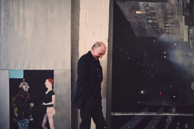
Chris Orr RA at work in the studio
Photo: Philipp Eberling
-
What you can discover today
The site is much simplified in terms of navigation. The homepage is something of an experiment, but our hope is that visitors will discover not only the things they came looking for, but also a whole load of things that they weren’t. The three main sections should speak for themselves, but in Exhibitions & events you’ll find all the details of our extensive public programme, with more material than ever before to complement and enrich your visit. News & blog collects together insight, opinion and commentary from RA Magazine and stories from across the wider RA, whilst the Artists section aims to give you a better understanding of the artists who make up the Academy. The latter section in particular will grow considerably over the coming months as we add more works by artists, interviews, photos and studio visits.
The site is also responsive, so it should give you a good experience whether you are accessing the site using a desktop computer, tablet or mobile. Please be aware that it is still in ‘beta’ – that is to say that we’re constantly making improvements, fixing bugs and tweaking the design, as well as adding more content and features as we go.
-

Sensing Spaces Lates
Photo: Benedict Johnson
-
Tell us what you think
Whilst we’re in beta, we hope that your experience of the site won’t be impaired by any remaining bugs – but if you uncover any, it would be very helpful if you could let us know in the form below.
We’re also extremely keen to hear your feedback. What do you like or dislike about the new site? What would you like to find here in future? And what other ways can we use digital technology to enhance your experience of the RA? Your input would be much appreciated and help us refine our plans.
-
Other ways we're opening up the RA
It’s worth adding that our new website is just one of many ways that the RA is renewing itself and investing in its future in the lead up to our 250th anniversary in 2018. You can read more about our mission and get a brief taster of our transformation plans in About. If you’re inspired by our plans and want to become part of our story then join up in the Support section. You can also follow us on Twitter, Facebook, Pinterest and Instagram.
Happy browsing!
Will Dallimore is Director of Communications at the RA.


