Six Academicians on the Abstract Expressionists
Six Academicians on the Abstract Expressionists
By Frank Bowling, Christopher Le Brun, Mali Morris, Vanessa Jackson, Fiona Rae and Sean Scully
Published 5 October 2016
The power and complexity of Abstract Expressionist art lies in the diverse sensibilities of its artists. Here six Royal Academicians respond to some of the movement’s greatest painters.
-
From the Autumn 2016 issue of RA Magazine, issued quarterly to Friends of the RA.
Franz Kline by Frank Bowling RA
I met Franz Kline in New York in the summer of 1961 while I was still a student at London’s Royal College of Art. By chance I ended up in a kind of youth hostel sharing with lots of preppy types. It was on their initiative that we went to visit Kline.When we arrived we were hit by these big, in-your-face, black-and-white pictures standing all around his studio. I was impressed by the striking, aggressive brush strokes that broke up the rugged whites and greys with strong diagonal blacks. You couldn’t mistake the stress in those agitated surfaces – the paintings were so direct, but also highly worked. I think the young people around me could sense this tension. It was pictorial and political in terms of the social unrest in the country and the racial tensions that came about at that time.
Kline seemed to live and dress as though he was a workman. I remember him driving us in a big new car at great speed down to a restaurant. He was a confident person who wore Levis and liked to dance. He was very generous and wouldn’t let any of us pay for a drink. I found that more and more in America then, a sort of open generosity that didn’t come with any feelings of patronage. It was just natural that if you were making money you would spend it.
Now, in hindsight, I can see that Kline found a very distinct way to deliver the primacy and power of the medium through his black-and-white works (Vawdavitch, 1955, pictured). It took me a good while after our meeting to realise the subject of the artist was the materials that they were using – it was about the paint itself and what you could do with it, not subject matter and storytelling. Kline had used a projector to blow-up and then trace his drawings onto canvas, to get away from overt subject matter and explore his real gift for scale and structure. The work had a reality, a ‘thingness’ about it to be valued. I can’t claim that I saw this then. I was just so struck by its complete newness.
After leaving college, back in London, it was somewhat taken for granted that I would produce work that reflected an idea of being Black and British. This was something I found uncomfortable. My work moved on very rapidly when I returned to New York and started using the projector and tracing my projections. I felt a connection with what Kline did with his projections. It was a liberating process. I could dissolve all this tight drawing and imagery from my past into these large open veils of colour. My own ambition, it always seemed to me, was to push all the accepted notions over the edge – like Kline, I really did believe that making something new was a command that I had to respond to.
Interview by John Bunker.
-

Franz Kline, Vawdavitch, 1955.
Collection Museum of Contemporary Art Chicago, Claire B. Zeisler 1976.39/© ARS, NY and DACS, London 2016/Photo: Joe Ziolkowski.

-
Clyfford Still by Christopher Le Brun PRA
This is thy hour O Soul, thy free flight into the wordless,
Away from books, away from art, the day erased, the lesson done,
Thee fully forth emerging, silent, gazing, pondering the themes thou lovest best,
Night, sleep, death and the stars.A Clear Midnight, Walt Whitman (1881)
Clyfford Still had the essential tendency of the great American artists towards the wordless, to what the literary critic Harold Bloom calls ‘un-naming’. Still was aware of the false light that words can cast and the responsibility on the artist not to undermine art’s natural subjectivity with the assimilation society seeks.
His paintings are huge in scale, their colour sombre and ecstatic. They are radiant with their core principles. They tend to singularities – described by Still as the ‘vertical necessity of life’ – that stand up in a confronting tall or wide surface plane spread with colour, co-existent with thresholds and borders.
“Life is a pure flame, and we live by an invisible Sun within us,” wrote the physician and essayist Sir Thomas Browne in 1658; these lapidary, timeless words are entirely appropriate for Still’s heroic ambition. His work constitutes an extreme of romanticism, possessing a nobility of purpose, dismissive of irony, quotation and the whole apparatus of art appreciation. It is today an attitude as rare and as mistrusted, yet as vital, as it was in the middle years of the 20th century.
Still cherished the central truth of painting as a bodily act and experience rather than an idea. Between the viewer and the embodied enigma that is painting stands no interpretation, nothing to diminish or ingratiate. His paintings’ very silence lets their flame-like colour appear in and for itself, and as the product of the human imagination can no more be explained away than we can ourselves (PH–4, 1952, pictured). Difficulty alone does not deserve our interest, but difficulty achieved through conviction may satisfy the deepest and most inward categories of our questioning.
There is a reason these paintings are big, occasionally overpowering. They are to be felt, walked in front of, glimpsed, stared at, dwelt with. See how much the light and colour changes as we move, near, far; the rectangle of the painting is rarely orthogonal. Which is the true light in which the painting is to be seen? Which is the true colour? There is no such thing. A painting is not a screen upon which phantom presence is portrayed. It is an object steeped in thought made by a solitary hand. What inner light it has is mind made.
-
Clyfford Still, PH-4, 1952.
Clyfford Still Museum, Denver/© City and County of Denver /DACS 2016 Photo courtesy the Clyfford Still Museum, Denver, CO/Photo: Courtesy of the Clyfford Still Museum, Denver, CO © City and County of Denver.

-
Hans Hofmann by Mali Morris RA
I wasn’t ready for Hans Hofmann’s paintings when I first saw them in American art magazines in the late 1960s. I remember thinking they were too strident, too muscular, and that I didn’t like them.A few years later I saw some in a Cork Street gallery; I stayed a while to have a good look. They seemed powerful, and although still shocking in their rawness, they were inviting, more accessible; I was able to read them, move around in their spaces, entering, re-entering. Painter friends were discussing them, Geoff Rigden in particular, and Alan Gouk was writing about them. I sought out more after that in New York and Toronto, and by 1988, when John Hoyland RA curated a great show at the Tate, ‘Hans Hofmann: Late Paintings’, I was a full convert. Colour as form, the potential for colour relationships to make light, space and temperature, structuring a world, culminating in the vitality and aliveness of a painting, or as Hofmann put it, The Real. It made sense, visually, emotionally and intellectually. It related to my growing adoration of Matisse, whose paintings showed how intelligence and the senses could be in accord.
Hofmann’s life is terrific to read about – a European arriving in America in the 1930s, the schools he set up in New York and Provincetown (many of the artists in the RA show were his students), his theory of painting, evolved from observing the world and analysing the Old Masters, and his sheer, galvanising, gutsy energy. Combining the lessons of Cubism with pure colour structuring took some nerve, some determination. When he gave up teaching, aged 78, there was a great outpouring of work, tender, raucous and everything between.
The title of the painting (pictured), the only one representing him in the exhibition, is a kind of summation: In Sober Ecstasy. It was painted in 1965, the year before he died, aged 85. The confrontational rectangles are familiar devices, but they appear always in new roles, in fresh pictorial dramas. These two relate closely to each other, in dark-toned hues, earthy, rosy. They anchor the eye then slowly shift in and out of a painting space that is chopped and churned by touches and traces and flashes of light. These look impulsively applied in a fast and furious way, but their rhythms and relationships are as precise, inventive and necessary as in any great composition, in any language; Miles Davis and Beethoven both come to mind.
-
Hans Hofmann, In Sober Ecstasy, 1965.
Private collection/© ARS, NY and DACS, London 2016.

-
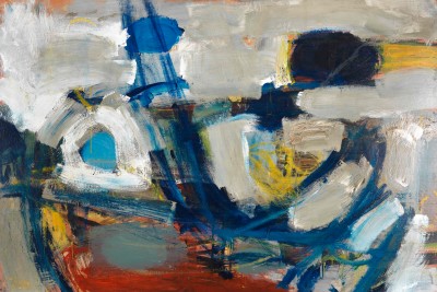
Joan Mitchell by Vanessa Jackson RA
“…every ‘lover’ I’ve ever had – every friend – nothing closed out – and dogs alive and dead and people and landscapes and feeling even if it is desperate – anguished – tragic – it’s all part of me and I want to confront it and sleep with it – the dreams – and paint it.” – Joan MitchellChicago-born Joan Mitchell entered the New York world of Abstract Expressionism in 1947 and had her first solo show in the city in 1952, after taking part a year earlier in the now famous ‘Ninth Street Show’, hung by the legendary art dealer Leo Castelli. She was a central figure, alongside Grace Hartigan (sadly omitted from the RA show), of the so-called ‘second generation’ of Abstract Expressionist artists, and very much a part of the male-dominated downtown crowd.
Abstract Expressionism was a tradition that we understand, in an evolutionary sense, as being slap-bang in the middle of the 20th century, but it is still central to a huge number of artists working today. It has come to be understood as a period of painting that worked for an ‘absolute’ reduction towards pure autonomy. Its artists were in fact diverse in both application and appearance and many an argument in the city’s Cedar Tavern would have them falling in and out with each other’s company. For many at that time, painting was the psychological action of self-expression through gesture, touch and movement – the physical encounter of freedom. This idea was central to the work of Mitchell, with the presence of the artist’s hand and body creating visual engagement. “A painting is like an organism that turns in space,” she said.
Her work of the early 1960s (Mandres, 1961–62, pictured) was turbulent, in continual movement, fast and fractured, “very violent and angry” she said. The art historian Linda Nochlin writes that she “worked with a whole lot of opposites that included dense versus transparent strokes, gridded structures versus more chaotic, ad hoc constructions, light versus dark etc.”
Mitchell was known as an abrasive character, and drink and depression took their toll, but she was always generous to other artists. I think I like her, and respect her calligraphic, improvised, lyrical abstraction, even though as a young feminist artist in the 1970s it was just about everything I reacted against. The male dominance of gesture and self-expression took me way back on a journey to Popova and the Russian Constructivists, and then forward to Agnes Martin, but I have enjoyed having another long look at Mitchell.
-
Joan Mitchell, Mandres, 1961-62.
Private collection, courtesy of McClain Gallery/© Estate of Joan Mitchell.

-
Willem de Kooning by Fiona Rae RA
I love Willem de Kooning’s ‘Women’ paintings for their formal qualities; the fields of slashing brush strokes and garish colours somehow corralled into dynamic compositions. I like reading them as abstract paintings that slip now and then into bits of imagery, then slither away again.De Kooning famously called himself a “slipping glimpser”. In an interview with David Sylvester in 1960 he said, “Content, if you want to say, is a glimpse of something, an encounter, you know, like a flash – it’s very tiny, very tiny, content.” The tension between subject and content, the way the one reveals and conceals the other, is played out in the ‘Women’ paintings (Woman as Landscape, 1965-66, pictured); the subject appears to be a woman composed of gestural brush marks, the content is ineffable and elusive. Even the ostensible subject is elusive. Just as you think you’ve caught hold of a bit of imagery you can name, it disappears into a flurry of brush strokes again.
But I have to admit that these paintings also disturb me because they appear to be pictures of violence being done to women’s bodies. The slashing brush strokes simultaneously attack the figure while constructing it. The bits of imagery mock and humiliate women; the ridiculous turquoise eyeshadow, the stupid high heels, the ugly lipsticked grins. I say to myself, well, maybe he is just mocking the caricatures of gender stereotypes, but at the same time I fear that de Kooning’s rage goes deeper, that the elusive content of these paintings is a desire to destroy and annihilate women. None of this can be proved, of course, because the paintings live in the netherworld of abstraction, that place of shifting ambiguities and mutable suggestions, where the artist can avoid saying what they’re really saying.
In order to make use of these paintings for my own purposes in my studio, I see de Kooning’s ‘Women’ as post-gender, tragicomic warriors submerged by and emerging from the wild field of abstract marks, and I interpret their painterly plight as a metaphor for the universal human condition, a desperate attempt to shape oneself as something against the nothing that surrounds us. I also see the paintings as existential blackboards; with each mark on the canvas de Kooning is marking his existence, and is stating that, like On Kawara’s telegrams, he is still alive.
-
Willem de Kooning, Woman as Landscape, 1965-66.
Private collection/© 2016 The Willem de Kooning Foundation/Artists Rights Society (ARS), New York and DACS, London.

-
Willem de Kooning and Barnett Newman by Sean Scully RA
Newman once said, to be an artist “was the highest role a man could achieve – it was a dream.”Opposite of de Kooning who thought art history was an enormous bowl of soup, that the artist could dip into at will and plunder. Newman held the contrary view, and believed, in fact: art history was irrelevant. This difference of opinion accounts for the radically different appearance and attitude of the art of these two great artists. The sensuous and spectacular colour and surface effects that de Kooning achieves, and his abiding connection to the human figure and to the landscape: find his polar opposite in the austerity and grandeur of Newman’s enormous, almost empty, canvases (Adam, 1951–52, pictured). Here is the difference. Newman turns his back on art history: and suffers and gains in equal measure for it. Since an argument in favour of his art, must always be burdened by the obligation to prove his radicality. But since he is not radical now, the ways to appreciate his art are often in danger of becoming ‘historical’. Which is ironically, the very last thing that Newman would himself, be prepared to accept.
De Kooning, of course, never has to confront this problem. Since his paintings are fully rounded, expressive arenas of colour, light and movement. Practically everything one needs to take from the history of painting, one can find in de Kooning. He is without question a master of drawing, and colour and surface making. And his constant connection to the natural world, and the supreme skill with which he does and does not abstract that connection: provides his work, and us as his audience: with the ultimate condition for love of art, and that is its content. With their human scale, de Kooning’s paintings fit in, more or less, anywhere into the history of art. Because, after all, that is where they came from. De Kooning can be hung next to Monet or Jackson Pollock. And the beauty of his surface, made through the sensuous layering of colour, is self-evident. De Kooning gives you no reason not to love him. His work is historically important and aggressively expressive.
Newman’s art has none of these natural painter’s advantages. His work is not sensuous nor does he offer expressive paintwork, and his work disassociates itself from almost all other painting in the history of art: except Mondrian, Suprematism and Russian icon painting. So instead of layered rhythm: Newman insists on austerity and clarity aimed directly at the heart of profundity.
On the streets of Paris at the beginning of the 20th century there was a similar discussion to the one that de Kooning and Newman had. This was between Matisse and Vlaminck (two great Fauve painters). Matisse wanted to show his paintings in the Louvre, and Vlaminck didn’t. Vlaminck thought the Louvre was a place of past art and so dead. Irrelevant to the art of now. As their story unfolded it became evident that Matisse had more to draw on, not the least of which was Giotto: and so his work was more ample and flexible. His ability to approach and circumnavigate potentially dead corners was supported by an enormous reservoir of knowledge. Thus he was both radical and classical. Vlaminck was merely radical and so disadvantaged, when Fauvism’s domination of the avant-garde was challenged by Cubism.
None of this, of course, proves that de Kooning was a greater artist than Newman. Though it does illustrate the fragility of an art approach that is stripped down and highly focused, since the artist who is travelling with almost no historical cargo, is subject to the limitation of latitude that this attitude engenders. And in the end, the public will decide.
-
Barnett Newman, Adam, 1951-52.
Tate: Purchased 1968/© 2016 The Barnett Newman Foundation, New York / DACS, London/ Photography: © Tate, London 2016.

-
Abstract Expressionism, Main Galleries, Royal Academy of Arts, London, 24 September – 2 January 2017. The exhibition tours to the Guggenheim Museum Bilbao from 3 February – 4 June 2017.
-
-
Enjoyed this article?
Become a Friend to receive RA Magazine
As well as free entry to all of our exhibitions, Friends of the RA enjoy one of Britain’s most respected art magazines, delivered directly to your door. Why not join the club?
-

Read more
-
RA Recommends
> 5 years ago
“Like a bomb going off”: how Albert Irvin found abstraction
In the 1950s when British painter Albert Irvin RA caught a glimpse of the explosive New York Abstract Expressionism scene, he abandoned his still-lifes and began conjuring pure sensation and emotion on his canvases. A new show at Whitford Fine Art looks at these early forays into abstract work.
-
RA Exhibitions
> 5 years ago
Jasper Johns: 10 works to know
Over the past six decades, Jasper Johns’s paintings, sculptures, drawings and prints have left an indelible mark on art. With the RA showing a major survey of his practice to date, here’s a closer look at ten of his key works.
-
RA Exhibitions
6 years ago
Abstract Expressionism: podcast round-up
From a curator’s introduction to reflections on 1950s New York, catch up on discussions surrounding our Abstract Expressionism exhibition.
-
RA Exhibitions
6 years ago
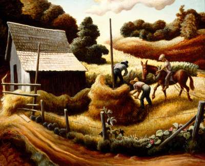
“I taught Jack that” – Thomas Hart Benton and his student, Jackson Pollock
Ahead of our America After the Fall exhibition, Debra N. Mancoff spotlights Hart Benton’s paintings of idealised rural life during the Great Depression – and his mentorship of an emerging young artist, Jackson Pollock.